Studes at Hardball Times runs a “Ten things I didn’t know last week” column that is always chockful of interesting stuff. This week’s column has a graph that I found fascinating called a treemap. Aside from the coolness of the techinque itself, Studes put it to good work illustrating Win Shares across the league. If you look below, you’ll see me ripping off his idea and doing it just for the Tigers.
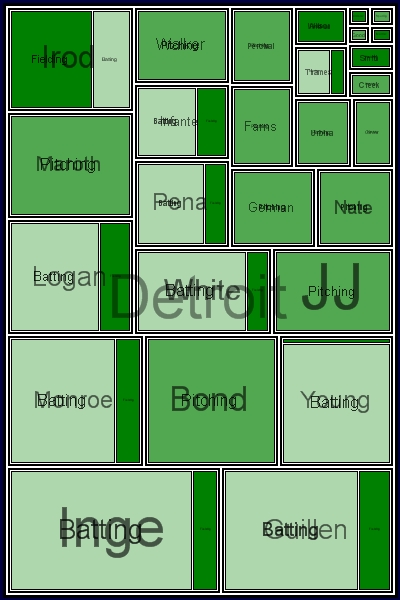
The bigger the box, the bigger each player’s win shares total. Within each player box, you can see the extent that the contribution was batting, pitching, or defense.
Stuff that jumped out at me from this graph:
- Brandon Inge is leading the team in win shares. Not bad for a guy who found himself with out a position last year
- Look at just how little Pudge has contributed offensively. At least his defense has been outstanding
- The Tigers best relievers by WS are Jamie Walker and Franklyn German
- Count the starting pitchers. Bonderman, Maroth and Johnson all have substantial real estate. Nate Robertson is smaller on the grid. But where is Ledezma? He has now win shares to date.
One final note on this, there were a couple players with negative win shares. The treemap doesn’t deal well with negative values, so I set those to 0. Those players with negative components were Smith, Wilson, Ordonez, and Higginson. The changes are pretty minor, and I don’t think it diminshes the value of the graphical representation.
Also, the Win Shares data is through games of May 18th.
I love the chart and I hope you show it again later in the season. However, is it possible to move the names up a little so they don’t blur with the fielding/pitching/defense line?
I plan to run it again periodically throughout the season. Unfortunately, I don’t really have control over label placement. I can tweak some stuff with regards to opacity though so I’ll try to make the next one more readable.